
Mind Gap
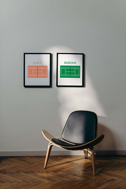
The MIND_GAP series is a collection of graphic design prints inspired by the London Underground
Each design uses symbols to represent words and allows your mind to fill in the GAPs. This works because the brain wants closure and will use prior understanding (schemas) to complete partial words or visuals making meaning out of the overall design
Using recognisable locations and underground stations makes it easy for the brain resolve the image. The attractive colour palette and minimalist design means these prints would look great in modern homes, coffee shops, bars, restaurants and commercial property
colour
#A1B3A5
#1A4524
#FFDCCC
#37434F
#009245
#009245
#FFCA6C

typography
GILL SANS
Johnston is the original typeface used by Transport for London which has been developed to the current version, Johnston 100
Gill Sans is perhaps the most similar typefaces widely available, which makes sense as the designer based it on Edward Johnston's typeface for the underground. It is considered a humanist sans-serif and was originally released by the Monotype foundry